Design challenge When I joined Healum back in 2016, the CEO and CTO at that time presented their vision and initial proposition: “How can we positively impact people with type 2 diabetes and other weight related conditions through machine learning and data driven insights? Our goal is to positively impact at least 500 people every year, improving their lives in someway”.
Contribution Being the sole Product designer, I was responsible for the end to end product design, from early resarch, concepts to final high level designs and development ready deliverables.
Discovery
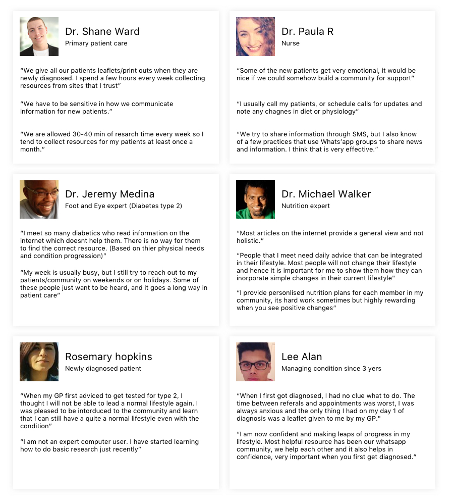
We had a few teams from NHS practices willing to work with us and we also managed to reach out to a few tier-2 weight management programs. I began interviewing all the NHS care givers that we knew, visiting various GPs across East London boroughs. I also interviewed a lot of new patients and patients who have been managing their condition since a long time. Here are a few quotes from the interviews which I later used to create a journey map. (Names and designations changed.)
User journey from the interviews
Based on both the personas, I came up with an initial journey map to illustrate experiences of long-term and newly diagnosed patients.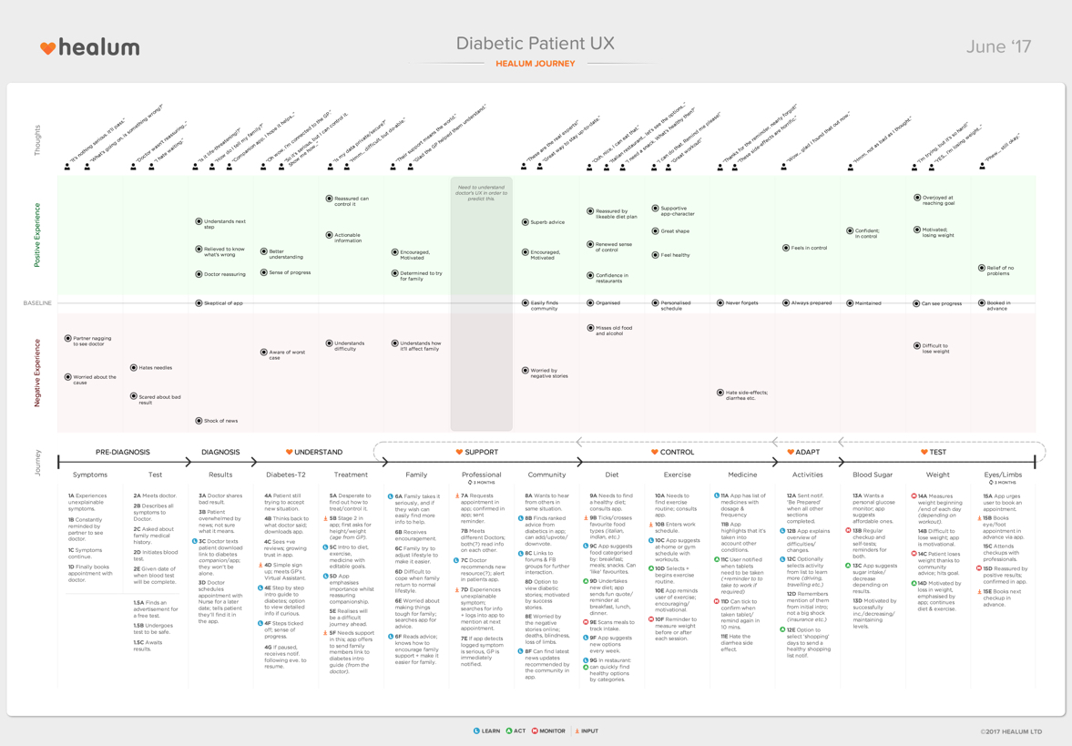
Moments that matter
is often a powerful exercise that provide insights into key moments that contribute towards a users good and bad experiences. I mapped out key moments in the journey that matters to the patients, moments that help in defining the patient's needs more clearly, which ultimately helped us define how we can take advantage of machine learning and data insights to make a positive impact.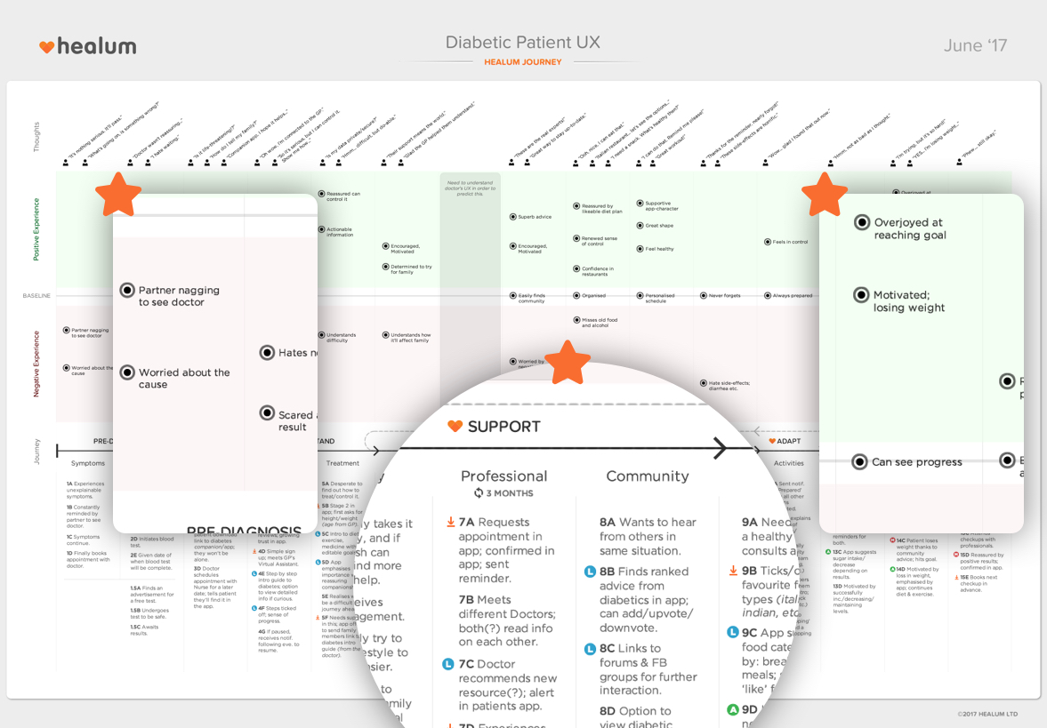
Key take-aways
- It was clear that care-givers needed a digital solution to share crucial, personalised resources to patients in the beginning of their journey- from the point they are diagnosed. Currently most GPs handed out leaflets or provided links through SMS messages.
- Care-givers rarely have time to sift through all the available resources- provide an easy way, auto recommendations based on a person's profile through intelligent match making.
- For new patients it was crucial to receive this information in an easily digestible format- develop an intelligent summary system so they do not have to read through entire articles.
- For patients managing their condition, it was important to receive frequent updates based on their physiological changes and advancements in the medical industry- get frequent inputs to update their profile and automatically suggest resources that would be helpful. Ensure their caregivers are always aware of the resources that a patient likes/consumes.
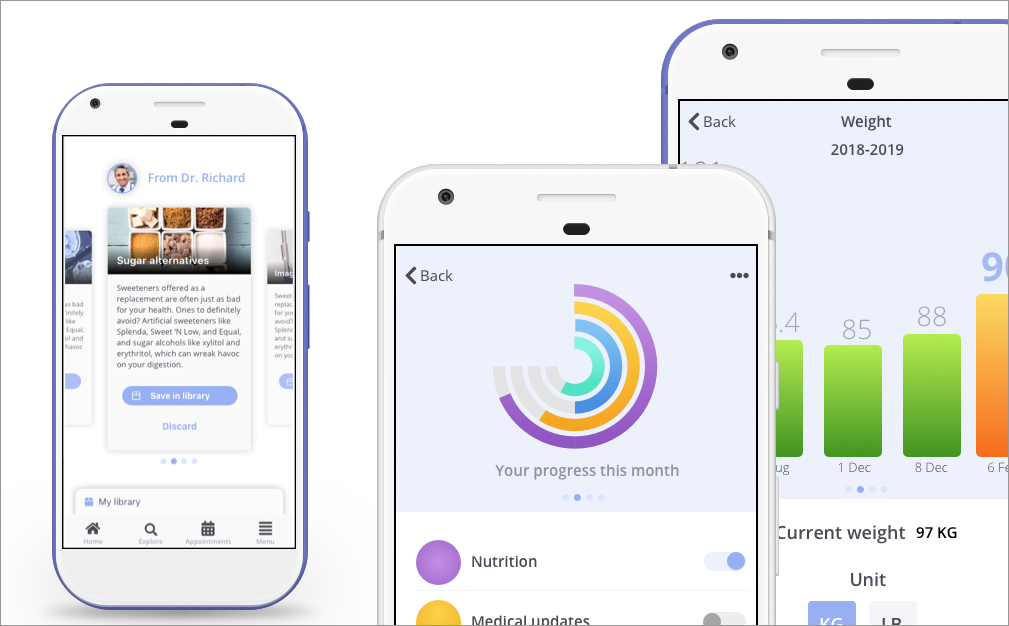
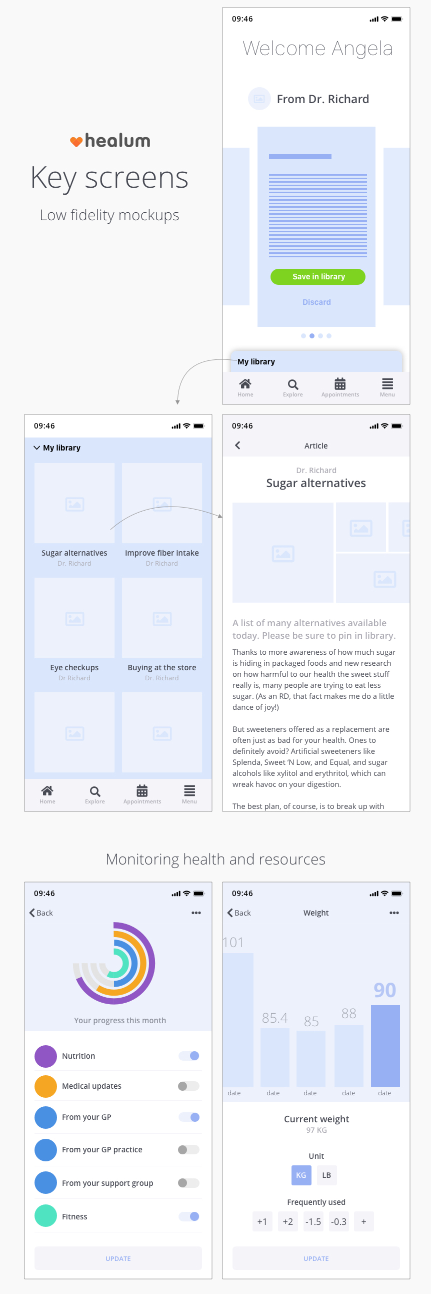
Mockups
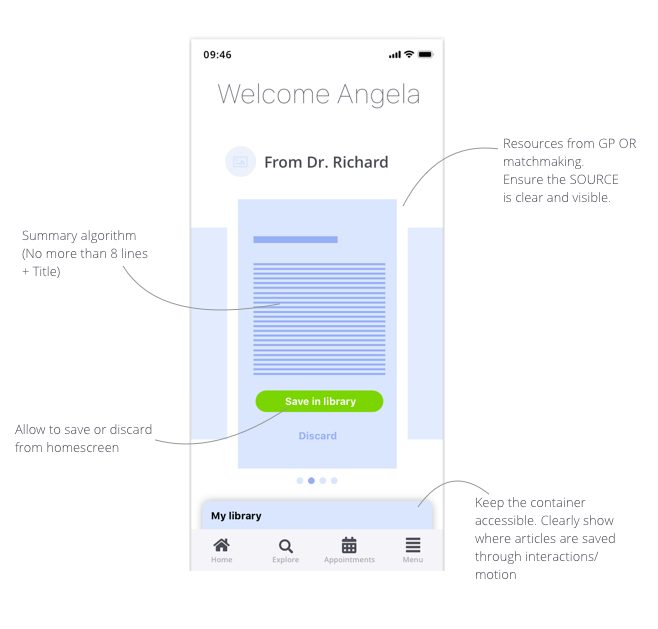
Home screen - Key components
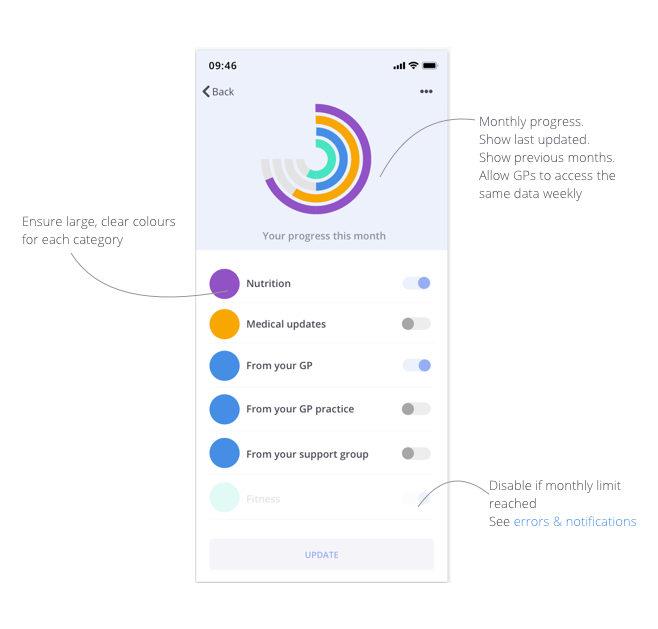
Resource monitoring/preferences - Key components
Key screens
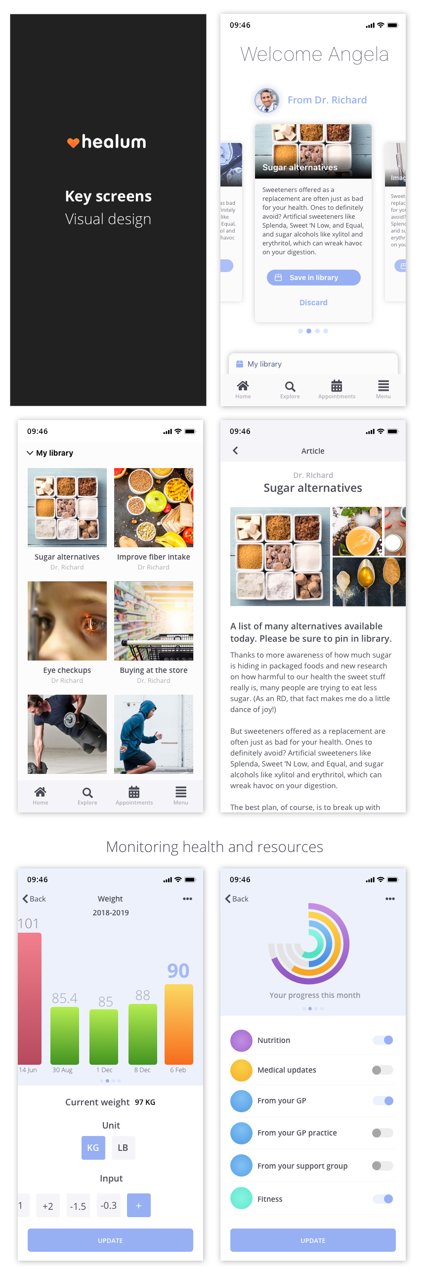
Visual design screens
Few things I had in mind while creating the visual designs:
- I wanted to keep the large text labels.
- Use of colours had to be minimal, considering our user group.
- Meaningful micro-interactions would further extend the usability of the product.
Learnings
Working with patients and doctors alike, one thing I learnt fairly quickly was Using their language. Using techincal terms or terms that we would often use in UX design served little or no purpose. It was really important to see the picture from their point of view, specially for newly diagnosed patients.
Domain experts, it was really important to get the right people from the start. Without the support and time given by key health professionals at important stages of the product development, we would not be able to achieve our goals in time or at all. It was really important to go out there and just ask people for help, it was also a pleasent surprise to discover just how many people are willing to help without knowing me or the company. It was a humbling experience.